Bringing harmony and alignment
PROBLEM
- Business challenge: As with the UK national health records implementation, there are many large and established organisations working on Australian eHealth records programme. Work packages are typically siloed, with little or no focus on cohesion or user experience. A Commercial off-the-shelf (COTS) product had been purchased to deliver the UI. Additionally, the syndicate based sign-up process was managed through a different government agency and was particularly long-winded and complex. Reaching out to influence contributing and sometimes competing partners required tact and diplomacy
- Technical challenge: Many technical considerations in implementation of national scale. The app draws on disparate data sources and operates within different security environments. Understanding and designing for opportunities and limitations of technical implementation was a big part of the challenge.
- Human challenge: We needed to bring consistency and harmony to the end user experience and ensure app met clinical safety standards and WCAG accessibility guidelines
PROCESS
Establishing shared vision for end-to-end app functionality was critical. This started by creating an overall map of current system and identifying gaps and opportunities for harmonising the UX, consulting with clinical and business stakeholders then moved onto working with implementation and COTS partner to deliver improvements. Some main activities:
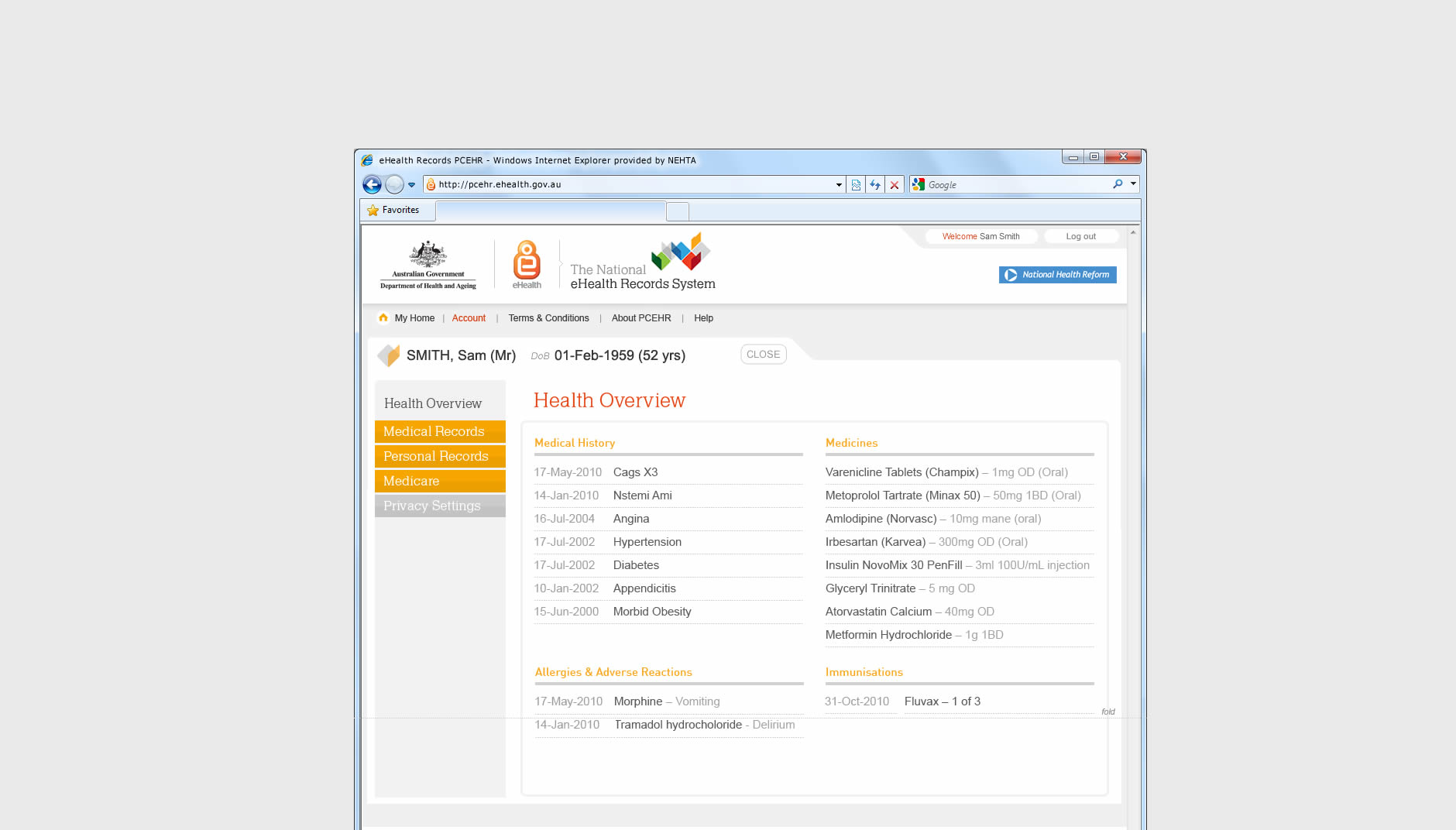
- UI improvements to the Consolidated View.
- Presentations to senior clinicians and national strategic stakeholder groups
- End-to-end and UX harmonising.
- Improvements to signup process, introduction of modal overlay to anchor users in multi-step process.
- Management of UI branding and implementation. Driving UI and messaging consistency out to marketing and comms
- Key member of partner driven usability taskforce, defining, driving and tracking usability improvements. Usability reporting.
- Delivery of artefacts, observation and support of usability testing
- Supporting clinical programme leadership with visual artefacts, aligned scenarios and click-thru prototypes
- Working closely with implementation partner to craft CDA layout
ROLE: Lead UX Consultant, working very with NEHTA project team, PMs, BA, TAs coordinating with build partner team (Accenture) and liaising with COTS partner to implement UI changes. Reaching out to other government organisations controlling syndicate login, signup, security management.
OUTCOME
Significant usability, UX & UI improvements were implemented. Project is ongoing.
Application of UI branding and design which had to take place within the constraints of the technical & UI architecture of the OTS product.
The off-the-shelf product
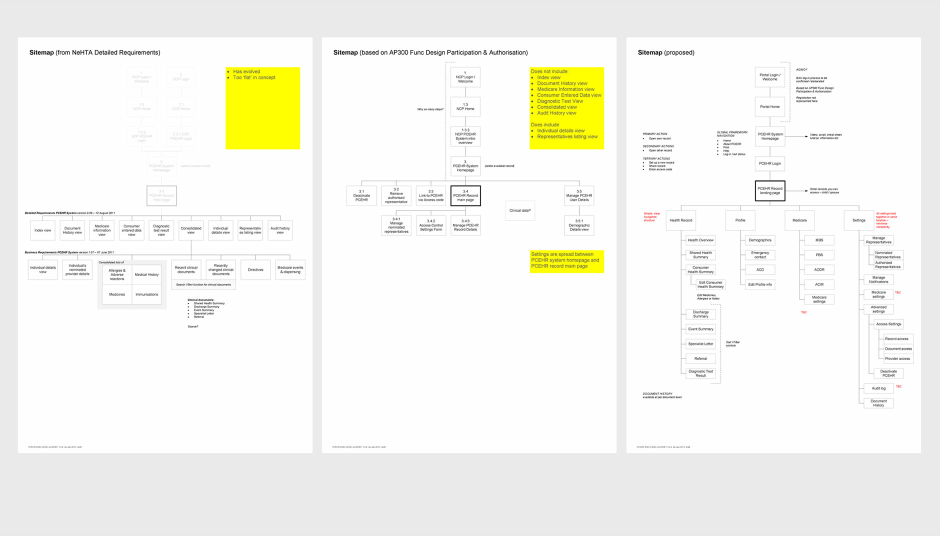
First ever visualistion of App sitemap according to different organisations specifications
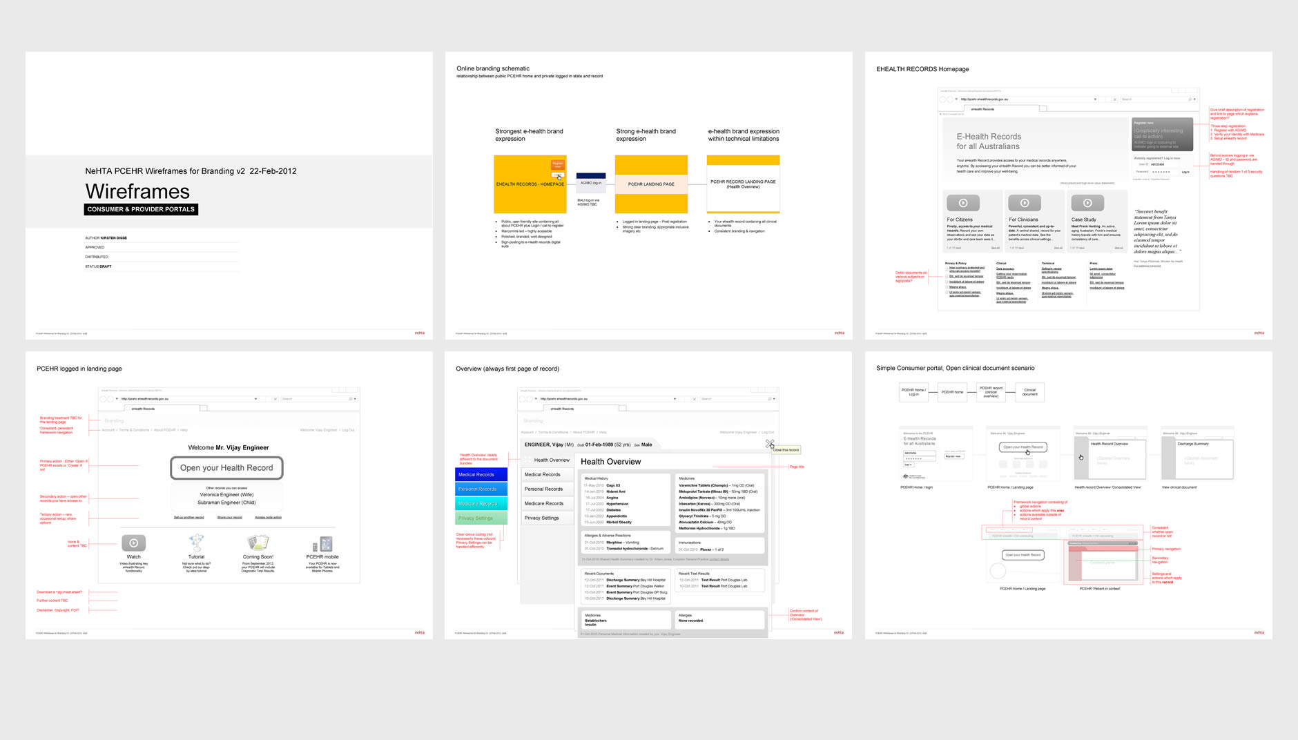
Wireframes for Branding purposes, showing entry points and UI structure
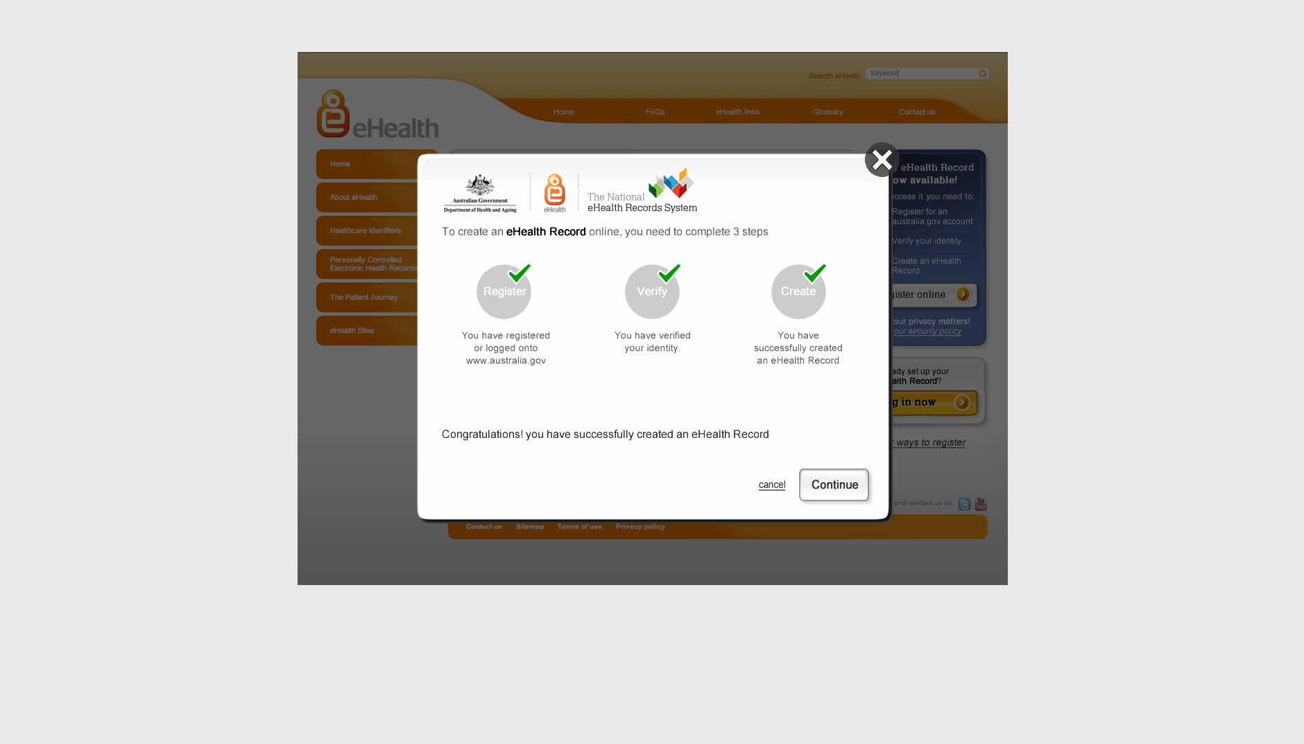
Modal overlay window to help anchor users in complex and long sign-up process.
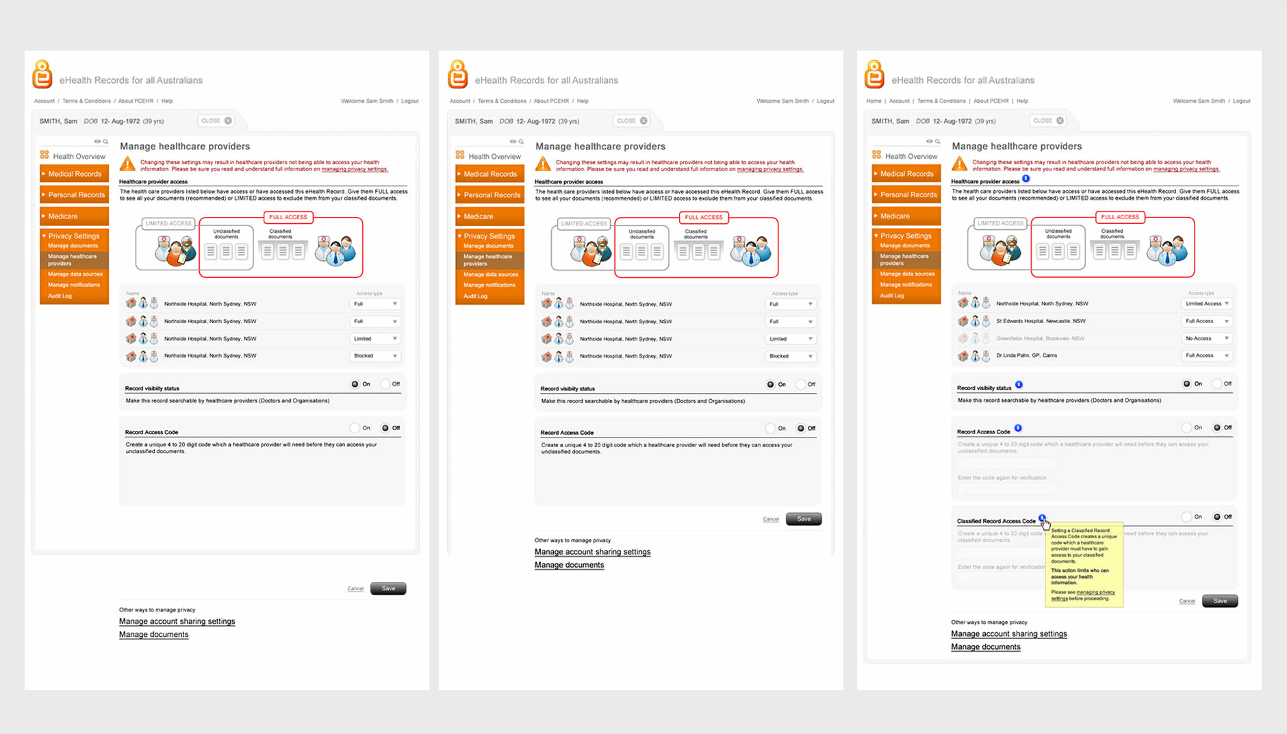
Efforts to simplify complex record access model via usability testing
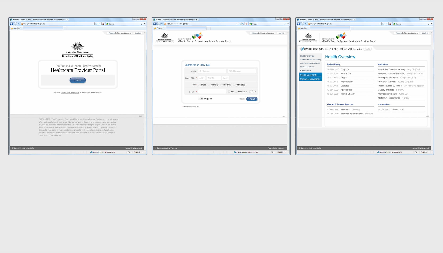
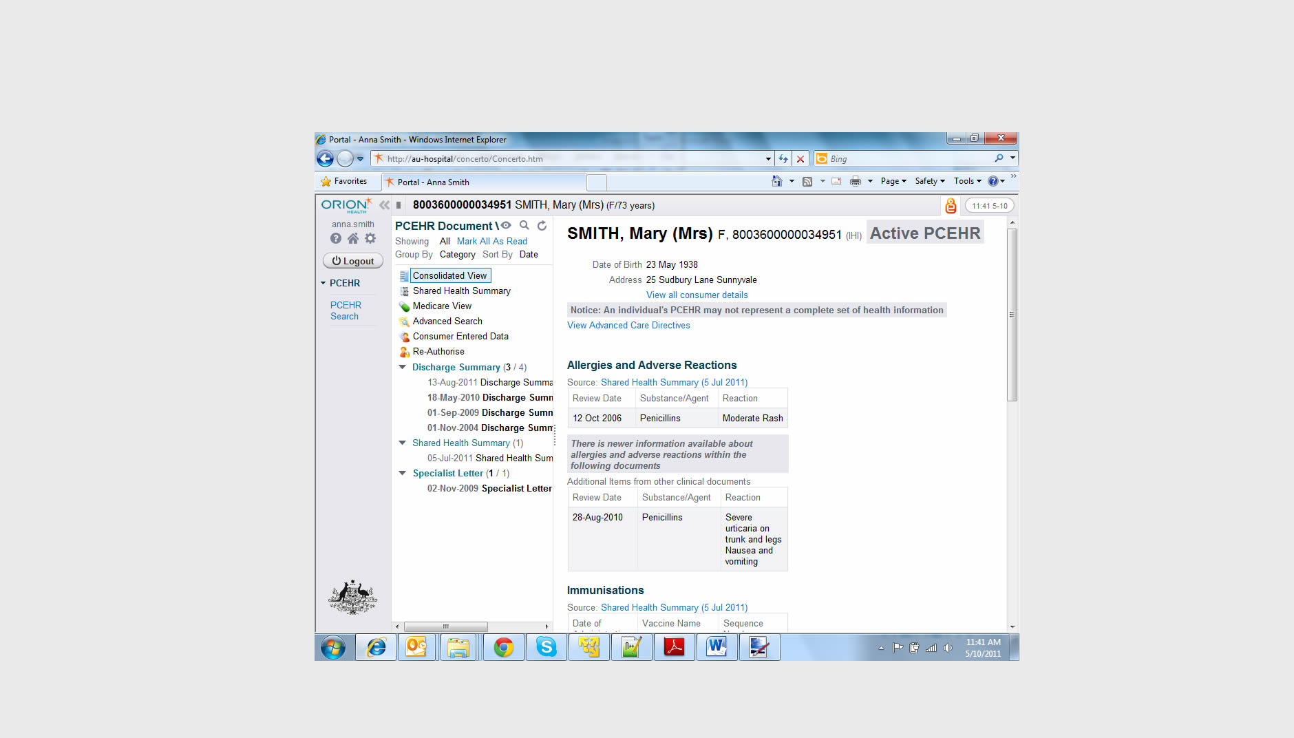
Aligned UI for Provider portal